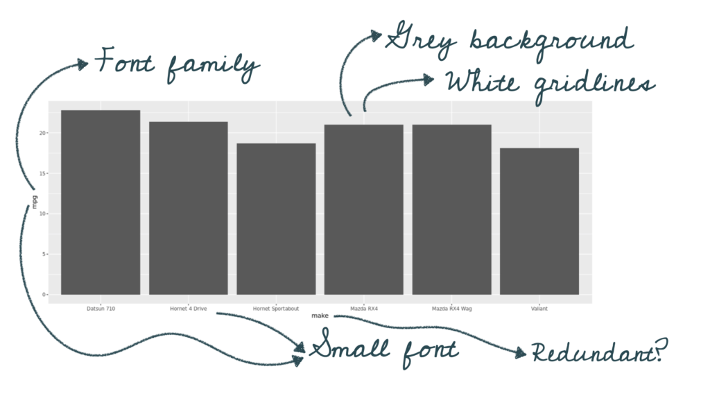
Several graphs are created within the clinical trial space for a single submission. While there is a lot of domain expertise around those who will draw conclusions from these graphs, that doesn’t mean we shouldn’t make them look good! As design and aesthetics help with figure interpretation, this post will walk you through the simple thematic changes needed to turn a default ggplot2 plot from drab to fab!
Using a subset of the mtcars dataset, we can create a straightforward plot of the miles per gallon for several car brands:
tiny_mtcars <- mtcars %>%
   mutate(make = rownames(mtcars)) %>%
   head()

library(ggplot2)
ggplot(tiny_mtcars, aes(x = make, y = mpg)) +
   geom_bar(stat = "identity)
But there are lots of ways we can improve on this plot:
By creating our own theme we can write a function that will allow us to turn our plot into this:
ggplot(tiny_mtcars, aes(x = make, y = mpg)) +
   geom_bar(stat = "identity") +
   theme_atorus() # call our new theming function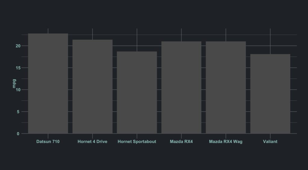
Step 1: Creating a scaffold
We can access the internals of a function by calling it in our console without parenthesis (pro-tip – you can open any function in an editor window within RStudio by hitting F2 with your cursor inside the function). I do this with theme_bw() because why reinvent the wheel? We’re going to use this code as a starting point to make our own theming function called theme_atorus()
theme_atorus <- function(base_size = 11,
                         base_family = "",
                         base_line_size = 11/2,
                         base_rect_size = base_size/22) {
    theme_grey(
       base_size = base_size,
       base_family = base_family,
       base_line_size = base_line_size,
       base_rect_size = base_rect_size) +
    theme(
       panel.background = element_rect(fill = "white", colour = NA),
       panel.border = element_rect(fill = NA, colour = "grey20"),
       panel.grid = element_line(colour = "grey92"),
       panel.grid.minor = element_line(size = rel(0.5)),
       strip.background = element_rect(fill = "grey85", colour = "grey20"),
       legend.key = element_rect(fill = "white", colour = NA), complete = TRUE)
}
Step 2: Customize!
This code chunk gives us a great starting point for beginning to customize our plots. While there are many colors we can assign to our plot by name ("blue") the ggplot2 color argument takes on hexcidecimal codes. Hexidecimal “hex” codes are 6 digit representations of colors, combining their red, blue, and green values. Below I used the Atorus’s hex code palette to set custom colors for the background, panel, and lines of the plot:
In the code below I added "Arial" as the base_family argument to demonstrate setting a default font family. This is fairly straightforward to change to the font used by your company. I also added some arguments to the theme to include more color and sizing variability.
library(ggplot2)

theme_atorus <- function(base_size = 15,
                         base_family = "Arial",
                         base_line_size = base_size/22,
                         base_rect_size = base_size/22) {
    theme_grey(
      base_size = base_size,
      base_family = base_family,
      base_line_size = base_line_size,
      base_rect_size = base_rect_size) +
      theme(panel.background = element_rect(fill = "#1D252D", colour = "#1D252D"),
            # added the same color argument to apply to the entire plot
            plot.background = element_rect(fill = "#1D252D", colour = "#1D252D"),
            panel.border = element_rect(fill = NA, colour = NA),
            panel.grid = element_line(colour = "#7C878e"),
            panel.grid.minor = element_line(size = rel(0.5)),
            strip.background = element_rect(fill = "#7C878e", colour = "#7C878e"),
            legend.key = element_rect(fill = "#1D252D", colour = NA),
            # remove the x title: might not want to make this a global setting!!
            axis.title.x = element_text(size = 0),
            # add an accent color for the plot text and increase size
            axis.title.y = element_text(color = "#86CAC6", size = base_size, angle = 90, family = base_family, face = "bold"),
            axis.text.x = element_text(color = "#86CAC6", size = base_size, family = base_family, face = "bold"),
            axis.text.y = element_text(color = "#86CAC6", size = base_size, family = base_family, face = "bold"),
            complete = TRUE
            )
}
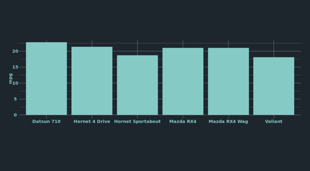
Now by simply adding our function to the ggplot we get our customized plot! Here I’ve added another argument to our bars that changes their color to really tie the graph together:
ggplot(tiny_mtcars, aes(x = make, y = mpg)) +
  geom_bar(stat = "identity", fill = "#86CAC6") +
  theme_atorus()
The added parameters within our theme function above are really only the tip of the styling iceberg. You can find all the different ggplot2 theming options here. It takes some thought to successfully utilize your company’s color palette, but we now have a reusable function to share within our entire organization – all within a single line of code!